First off, I rerecorded the vocals on War that I posted on February 27th. If you would like to listen to the song the new vocals go to: https://wp.me/s1yQyy-war.
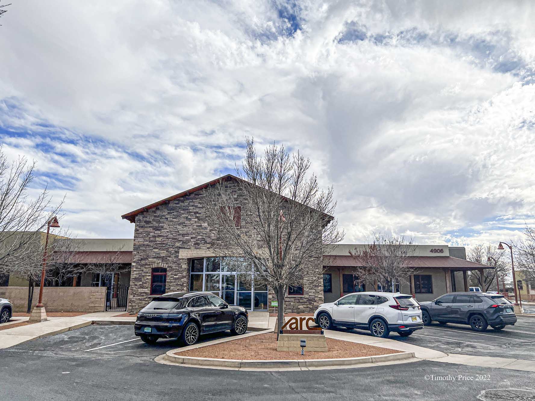
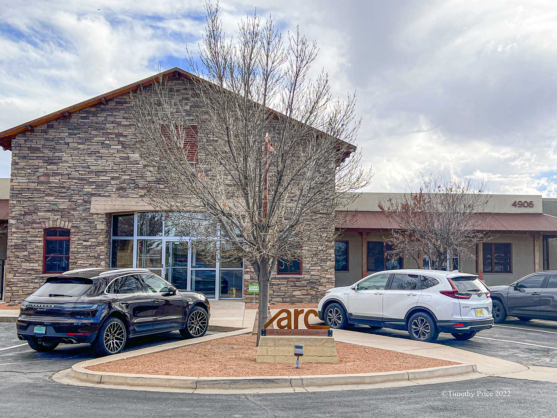
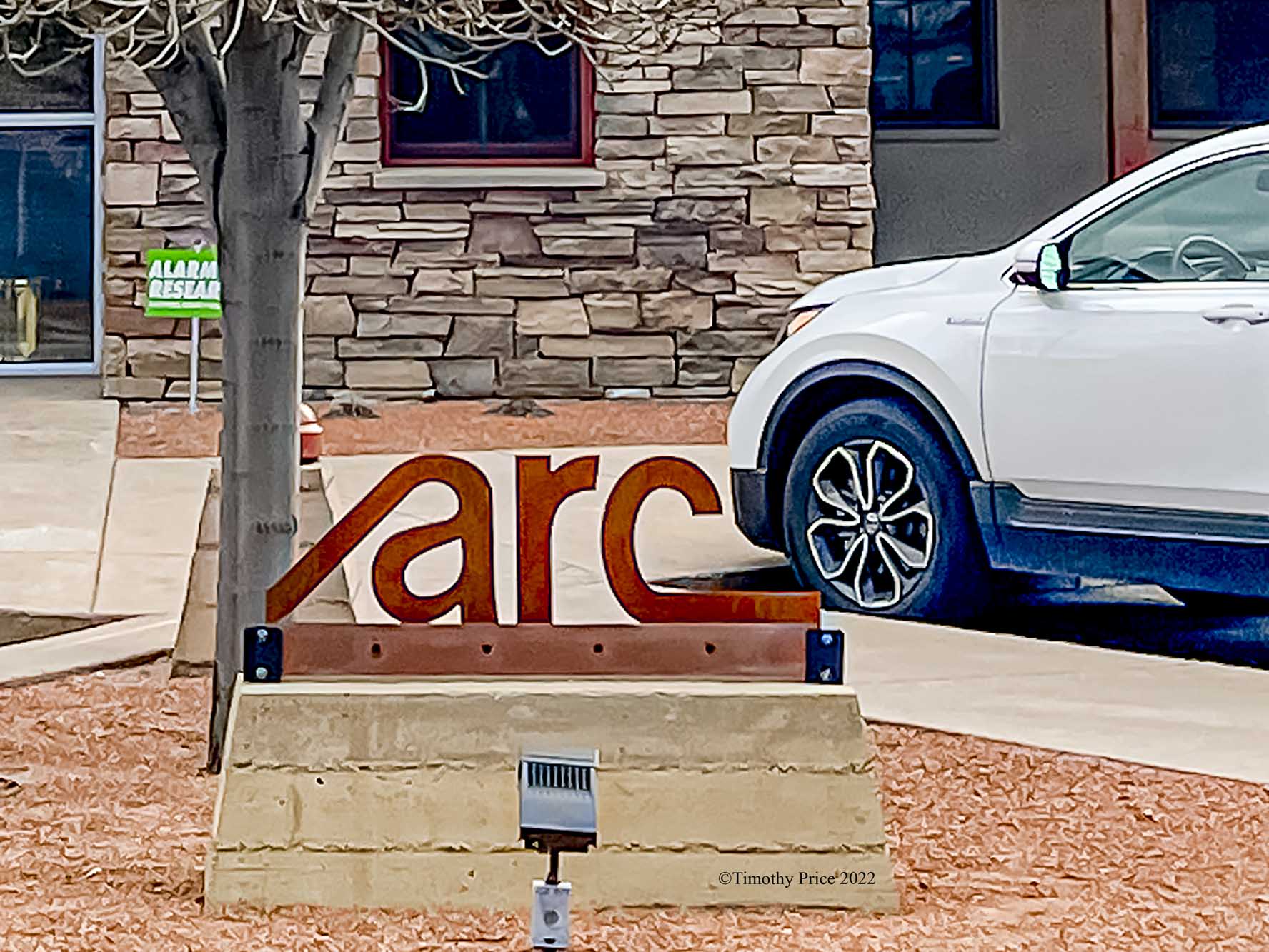
Our Iron “arc” sign was delivered today. I clamped it on to see how everyone likes it now that we are used to the blue sign I put up in November. If we decide to keep the iron sign on the monument, then I will drill it and mount it permanently, and we’ll find another place for the blue sign. If I put the blue sign back on the monument, then I put the iron sign somewhere else.

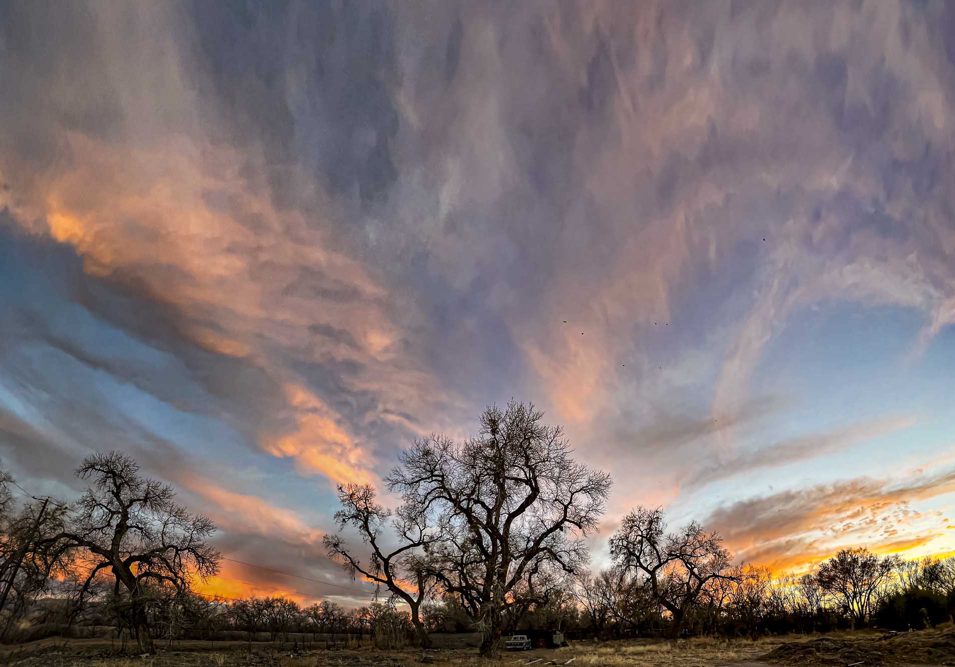
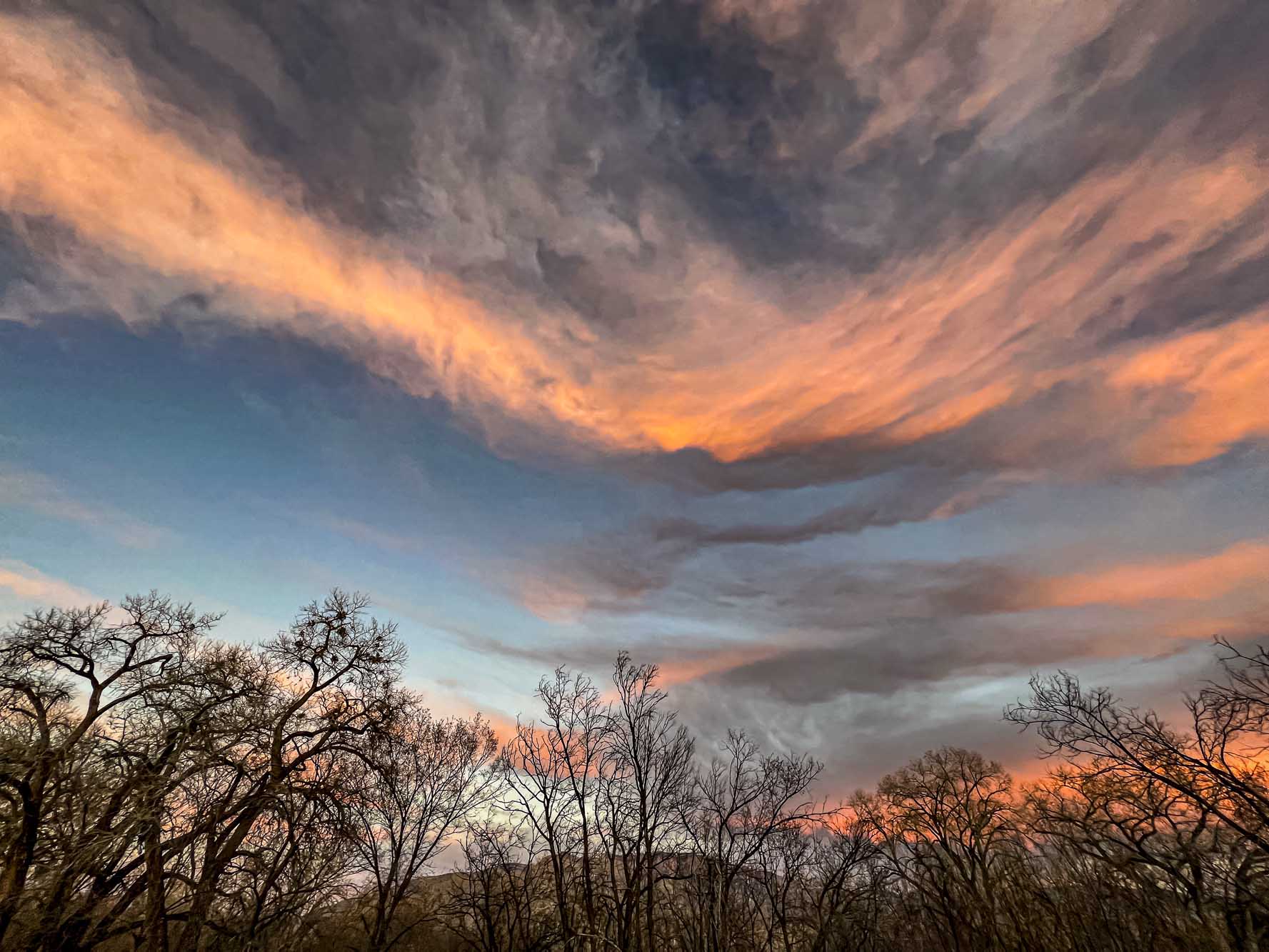

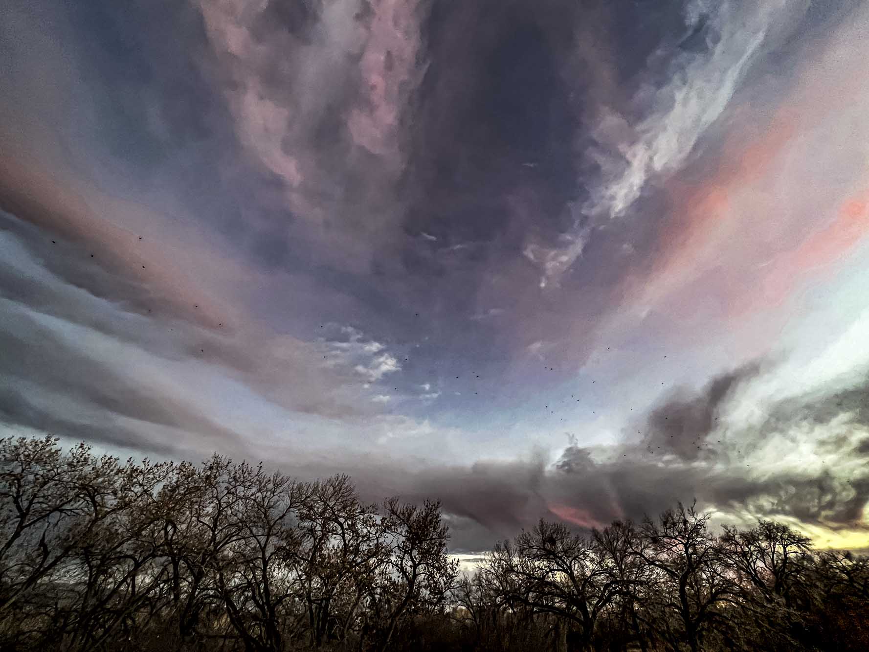
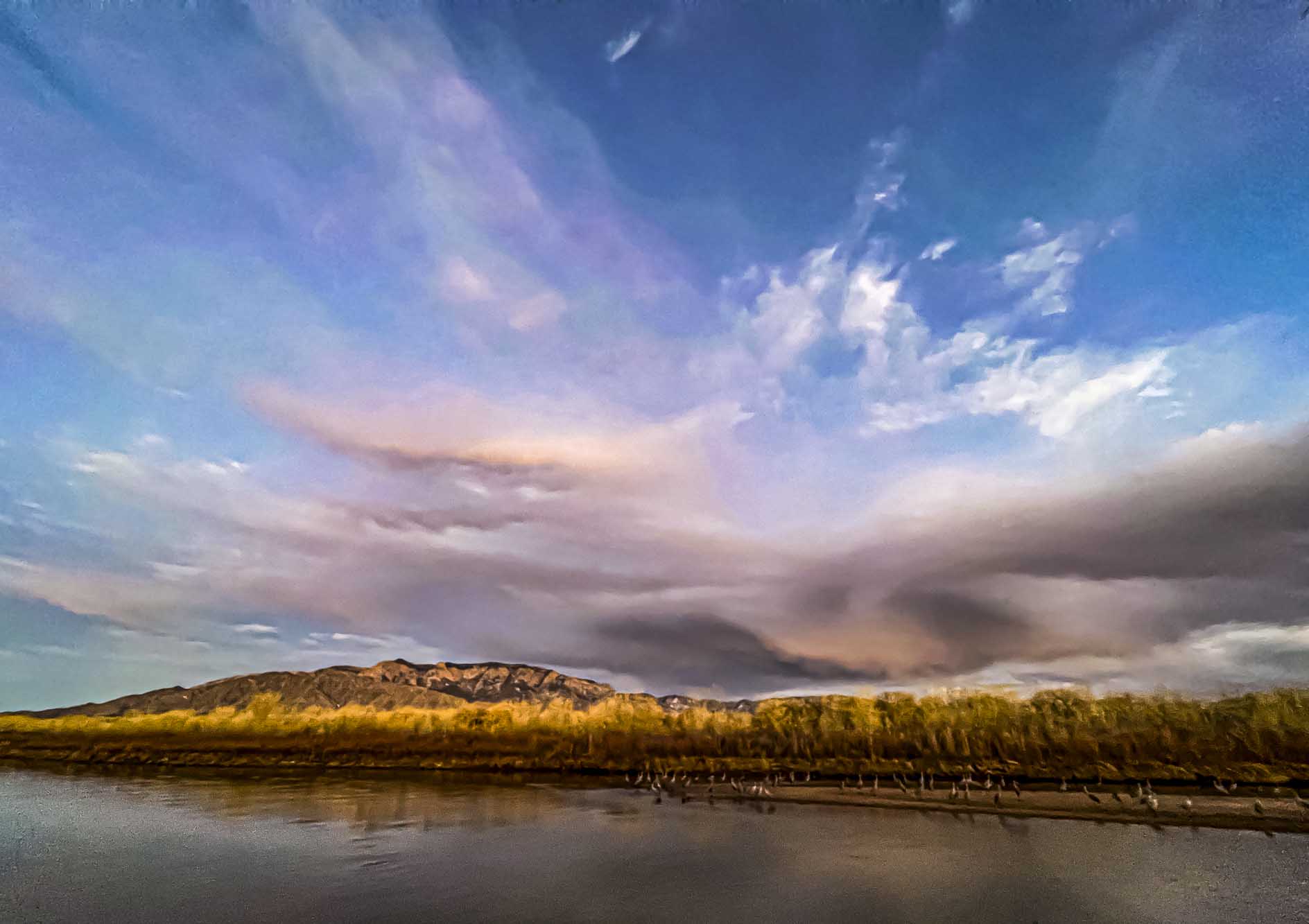
The sky and clouds were exceptionally beautiful tonight

Your sky pictures are always rewarding. The iron sign looks pretty good there!
The sign blends in with the color scheme of the building and campus much better. Thanks, Bruce.
I like the iron sign. Sleek and stylish. Pics are stunning, Tim. Sky amazingness.
I prefer the new sign, it has much more style and it fits better with the buiding behind.
Thanks, Rudi. I agree.
Wow. Lovely pics AND the new sign looks great.
Thanks, Shey.
The new sign looks great. Excellent choice, Tim!
Thanks, Herman.
Your skies are always amazing, like a colourful ocean of clouds.
Thanks, Heidi.
Curious to see what you all decide on the sign…
Thanks, Couriers. Do you have a preference?
Okay… forgive me if I begin with the breathtaking skies but really the painter was exceptionally creative!
On the sign, I definitely like the new one more (a lot more) but the blue one is more visible on that spot.
The painter was thinking of you. You are right about the visibility, but the iron sign fits in with the scheme much better.
Of course it does and -as I said- it is much much nicer!
Awww…. painter!
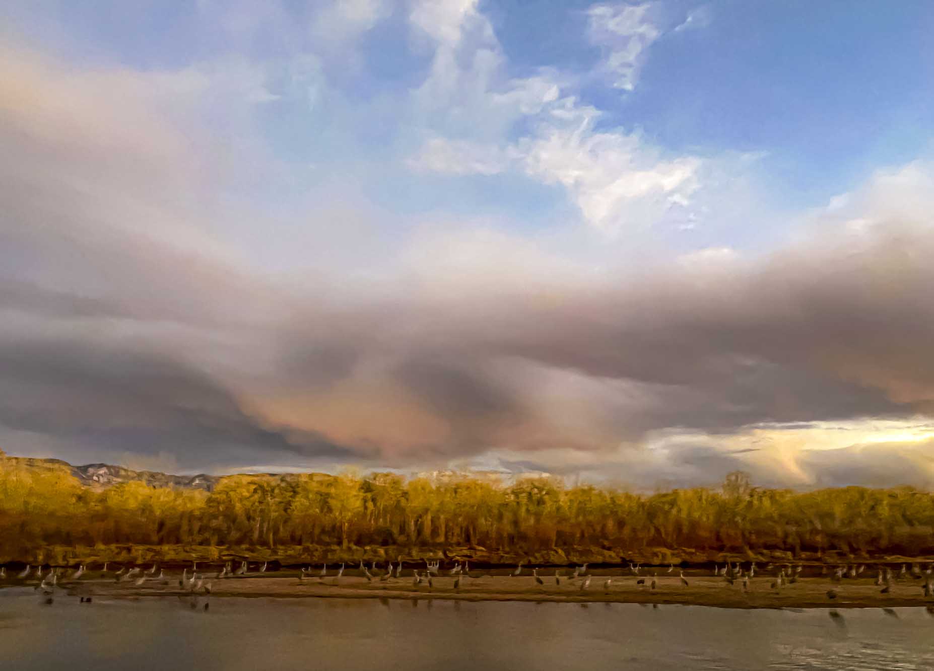
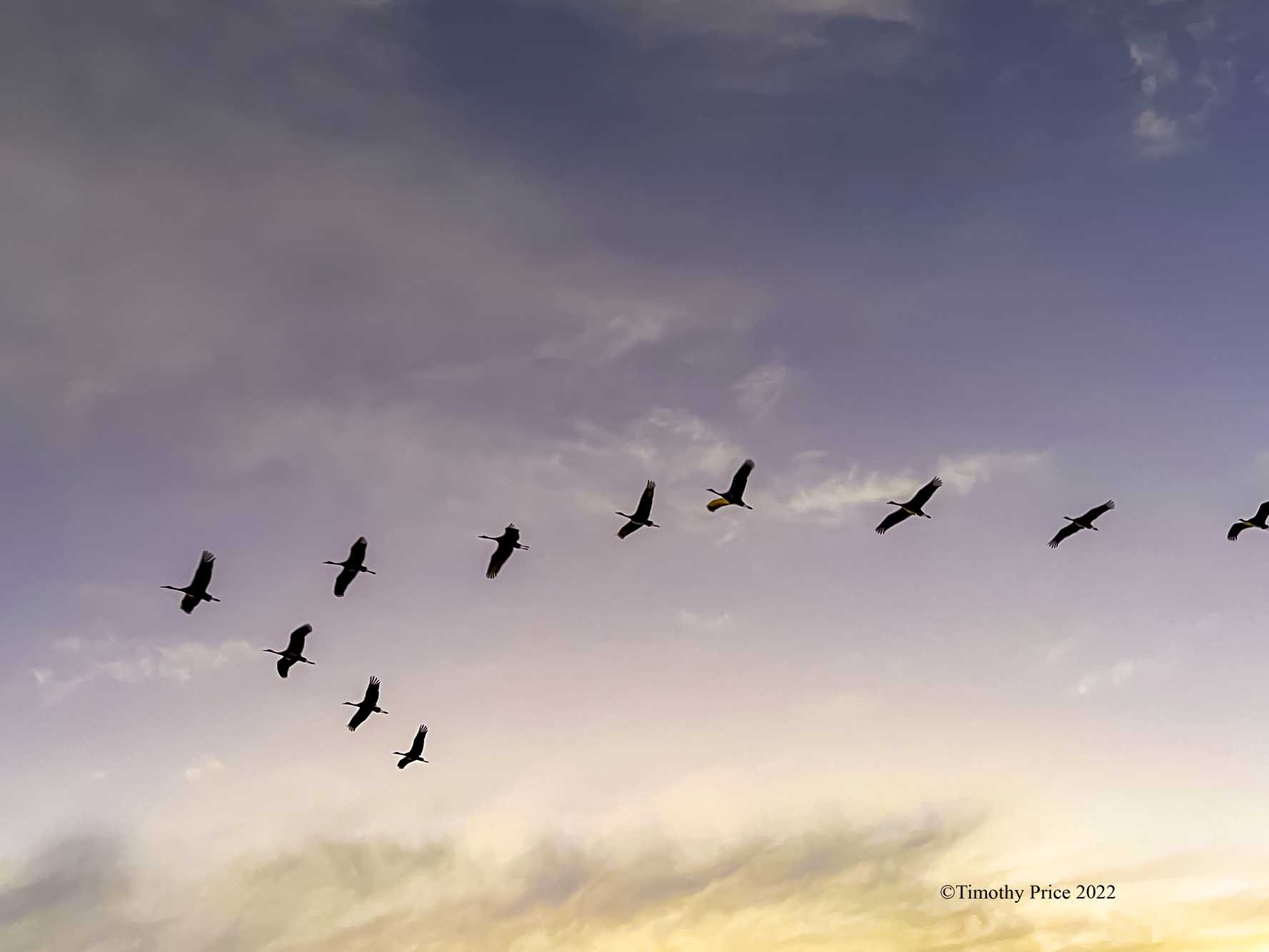
A beautiful echelon of birds
Thanks, Holly.
My pleasure!
Cool sign and even cooler sky and bird pics!
Thanks, Dale.
The blue sign really catches the eye, but the new sign fits the color scheme better, blending in, but I am not sure you want a sign to blend in.
I enjoyed seeing the skies and geese. You have some gorgeous scenery down there.
Thanks, Lavinia. The blending in is a good point, but also preferable, I think.
Guess we agree with all: The new sign is best, the clouds are beautiful and the cranes have near perfect spacing. Great captures all.
Thanks, Maj & Sher. The cranes have a way of being well spaced in their echelons.
I like the iron sign, it is lit? The blue sign is nice too but not as posh. You live in a beautiful place Timothy.
Thanks, Charlotte. There is a light on the sign. I will have to see what it looks like lit. When the time changes on the 13th it will be dark when I come into the office. We live in paradise.
The sign looks great.
Great letter shapes.
Why did you put up the sign?
We need a sign so people know which building our business is in. The blue sign is large and does not fit the color scheme of the buildings in the plaza. I had the iron sign made to see if it fit in better. Thanks, abvr.
Oh that is so exciting Timothy
I like the red lettering
The red is rust, but it’s hard to tell because it’s back lit by the winter sun.
Oh rust-red is also a lovely colour
Yep, the new sign is a keeper! I’m listening to “War” again now, the news gets worse every day.
Thanks, Tiffany.
The picture of the birds flying in formation is very nice. Nice pattern with nice sky in the background.
Thanks, Yellow Cable.
I love the iron one, Timothy. It is so slick and attractive.
oh the piece on war continues to tug at my heart. Love the pictures and the iron one for sure Tim 🙏
Thanks, Cindy.
Is this the sign you finally received after all those labor/supply issues? Congratulations! It looks great. Now I have “I Saw The Sign” by Ace of Base stuck in my head.
Yes it is. I’m happy you like it.
Then there’s
“Sign, sign, everywhere a sign
Blockin’ out the scenery
Breakin’ my mind
Do this, don’t do that
Can’t you read the sign?”
By the Five Man Electric Band to get stuck in your head, also. Thanks, JYP.
My nod would be to the new sign – as you mentioned above, the color scheme is more complimentary to the rest of the surrounding palette. Guess the choice is really weather you need to grab someone’s eye or not as the blue does pop more.
Only two people at the office who are on the fence about it. Otherwise it’s been 100% for the new sign. Thanks, Brian.
The last shot ~ Canadian geese flying in formation ~ now that is a sight and sky that I always 100% stop, stare, and dream as I watch them fly by 🙂 For the sign, I do like the new one!
Thanks, Randall.
The iron sign looks quite classy. The blue sign shows “arc” better.
Perhaps the blue sign can go high up on the building?
We will probably put the ARC on the wall with the gate. Thanks, Resa.
Well done on your sign! Love those skies …
Thanks, Julie.